The design guidelines, visual standards, color architecture, and brand voice governing all digital interfaces, pitch decks, proposals, and publications.
Kvann Health operates an institutional two-tier brand model: a corporate masterbrand paired with an operational product engine.
Entity: KVAN Health LLC (Oregon, USA)
The overarching corporate entity. Represents enterprise stability, healthcare governance, institutional authority, and rigorous systems engineering.
Offering: Ambulatory Schedule Optimization Engine
The day-to-day clinical software. Represents schedule continuity, fluid patient flow, and the calm, protected midday rest buffer for clinicians.
Selected from canonical source (sample_logos.png). High-resolution isolated marks and usage rules.
Architectural Monogram 'K' (Option 3)
• Vertical Pillar: Deep Forest Spruce (#1C5240), symbolizing clinical stability and physician groundedness.
• Curved Wings: Clinical Slate (#586068), expressing capacity recovery and operational balance.
• Usage: Main website navigation, official letters of intent, contracts, and investor pitch decks.
Circular Balance Emblem (Option 2)
• Two Sweeping Crescent Blades: Spruce & Slate arcs in dynamic rotational equilibrium, representing continuous, unfragmented appointment flow.
• Protected Center: Clean circular negative space representing the guaranteed midday lunch break.
• Usage: Product pills, schedule compaction widgets, app favicons, and clinical dashboard stamps.
Reference: Option 2 (Circular Balance) & Option 3 (Architectural Monogram) officially approved for production.
Directly sampled from the approved visual artifacts. Warm, human, institutional. Body and headline colors meet WCAG AAA; structural accents meet AA for their declared roles.
Role: Primary Canvas
Role: Brand Anchor
Role: Structural Accent
Role: Core Typography
Built for high-density clinical clarity. Displays and body set in Plus Jakarta Sans; telemetry and time blocks set in JetBrains Mono.
Our scheduling assistant groups clinical visits closely together so open slots are large enough to be booked. It strictly preserves lunch hours so doctors have reliable time to recharge and catch up on notes before the afternoon starts.
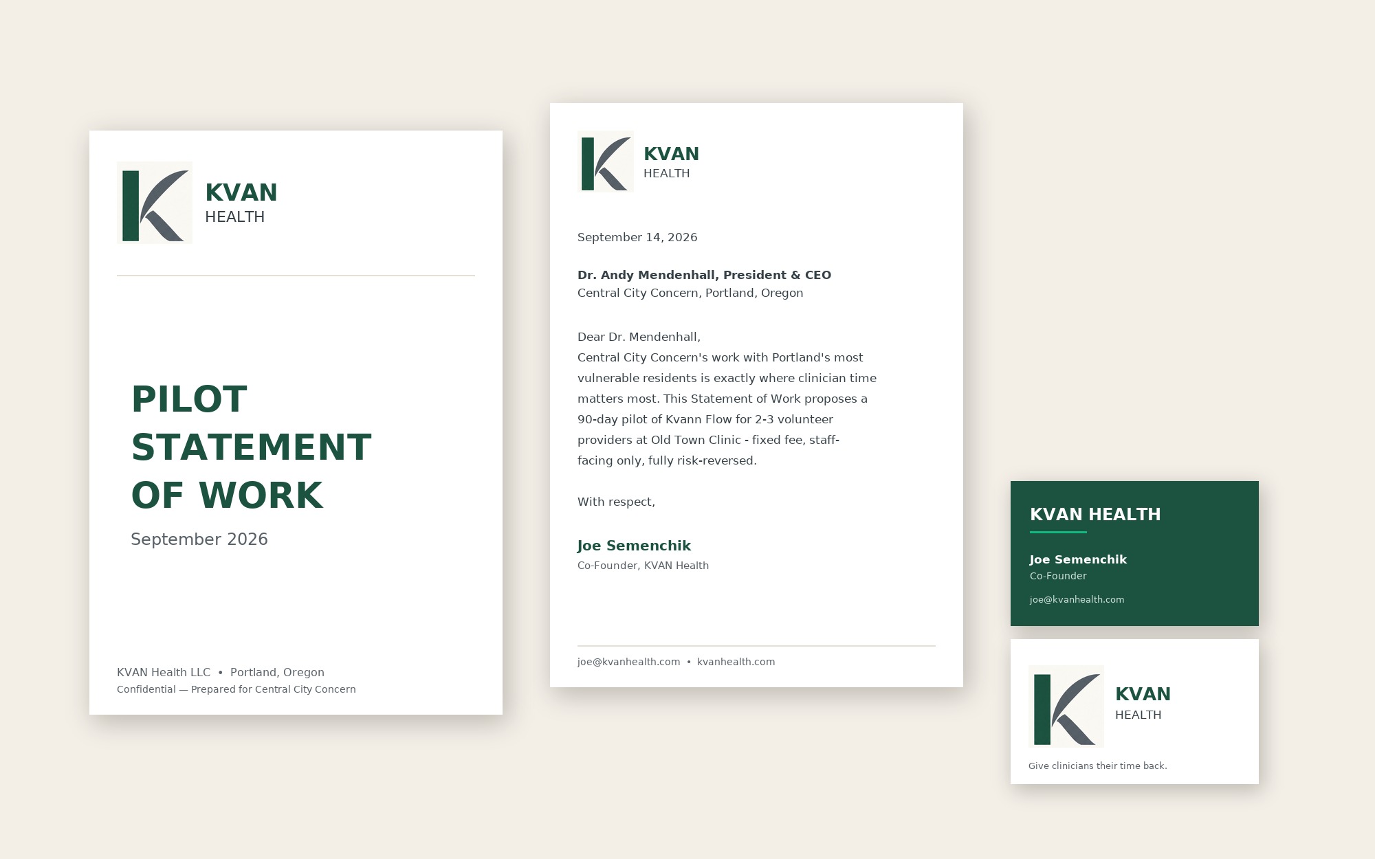
High-fidelity studio mockup showing how the brand identity renders in executive pilot proposals, statements of work, and partner correspondence.
Interactive components built on the 8px baseline modular scale for Lovable.dev and React implementation.
Humble, factual, and respectful of the daily clinical grind. Strictly free of AI marketing buzzwords.
Non-negotiable placement rules protecting mark legibility across print, screen, and embroidery.
Production specifications for every external artifact. Brand fonts are screen fonts; print artifacts use the declared system pairing so files render identically on any client machine.
Rules for every figure that carries a number — where credibility is won or lost.
| Context | Correct Form | Never |
|---|---|---|
| Legal entity (contracts, SoWs, BAA) | KVAN Health LLC* | |
| Commercial masterbrand (marketing, decks, site) | Kvann Health | |
| Product | Kvann Flow | |
| Domains / email | kvanhealth.com (primary) • kvannhealth.com (redirect) | |
| Feature codenames (internal/product UI only) | Gravity Stacking, Lunch Firewall, Kvann Tetris |
*Pending Oregon SOS registration confirmation — see footer imprint rule.